Hey there, are you struggling to get more clicks and sales on your website? Maybe your visitors just browse and leave without taking action, and it’s frustrating to watch those numbers stay flat.
You’re not alone, pal, tons of folks face this same headache every day.
Here’s a cool tidbit, companies like Visa saw a 20% jump in conversion rates just by tweaking content for different user groups. That’s right, small changes can make a big splash! Stick with me, and I’ll walk you through 7 simple A/B testing ideas to boost your conversion rates.
From tweaking call-to-action buttons to sprucing up landing pages, I’ve got tips that can turn things around for you. Ready for a game-changer? Let’s roll!
Key Takeaways
- Test CTA button colors and sizes; Ben boosted conversions by 17.63% with color changes.
- Experiment with headline styles; ClassPass doubled sign-up goals to 10% using curiosity-driven hooks.
- Adjust pricing tiers and offers; Alaska Airlines saw an 18% rise in loyalty sign-ups with tiered pricing.
- Use white space in layouts; Grene increased eCommerce conversions from 1.83% to 1.96% with a mini-cart redesign.
- Show savings on checkout pages; Zalora gained a 12.3% jump in checkout rates by highlighting return policies.
Optimize Call-to-Action (CTA) Buttons
Hey, want to boost those click-through rates on your site? Start messing around with your Call-to-Action buttons, and watch the magic happen!
Let’s talk about boosting your conversion rates with some smart tweaks. Testing button colors and sizes can make a huge difference, trust me!
- Start with color changes, because they grab attention fast. Did you know Ben bumped conversions by 17.63% just by switching up his color palette? Play with warm colors like red or orange to spark urgency, or cool colors like blue to build trust. This kind of A/B testing on your call-to-action (CTA) buttons can skyrocket click-through rates.
- Size matters more than you might guess. A bigger button screams for a click, especially on product pages or checkout pages. Test larger CTAs to see if they pull more user engagement, and track the conversion rate with each tweak.
- Mix up bold shades with subtle tones for variety. Think about color psychology here, as certain hues can nudge a visitor to act. For instance, a bright green might shout “go” for a Buy Now page, just like Ubisoft saw conversions jump from 38% to 50%.
- Watch how tiny shifts impact user experience (UX). A slightly wider or taller button could improve visibility on landing pages. Keep running split testing to spot what drives the best results for your online store.
- Don’t shy away from wild ideas in your experimentation culture. Swap a dull gray for a flashy yellow and see the magic on category pages. It’s all about finding that sweet spot for customer engagement.
- Track every change with clear data for statistical significance. Use tools to measure how each button tweak affects lead generation. This way, you know exactly what’s working for your website design.
- Keep the conversation going with your audience through these tests. Ask for feedback on social platforms like X (formerly known as Twitter) about their favorite visual elements. Their input can guide your next round of multivariate testing.
Experiment with placement on the page
Hey there, readers, let’s chat about boosting your conversion rates with some smart moves. Testing where you place things on your page can make a huge difference with A/B testing.
- First off, try shifting your call-to-action (CTA) buttons around on your landing pages. Put that shiny button at the top for quick clicks, or test it lower after some juicy info. See where users engage more for better click-through rates. It’s like finding the sweet spot on a treasure map.
- Next up, play with the spot of customer testimonials or social proof on product pages. Place them near the CTA to build trust fast, or closer to the top to hook folks right away. Strong user engagement often comes from seeing real feedback, so test it out. Think of it as planting a flag where folks notice.
- Also, mess around with images or visual elements on your checkout page. Move a cool product photo near the buy button, or test it higher to grab attention first. Visuals can spike conversion rates if placed just right, so keep experimenting. It’s like setting the stage for a big show.
- Then, consider testing the placement of discounts or savings offers on pricing pages. Show that sweet deal upfront to spark interest, or place it near the final CTA for a last push. Highlighting value can lift those conversion rates, especially with smart positioning. Picture it as dangling a carrot at the perfect moment.
- Finally, think about moving key content or interactive elements on category pages for better user experience (UX). Test placing a free trial offer at the top to draw folks in, or midway after some details. Inspired by Brooks Running, who saw an 80% drop in return rates with personalized services, positioning can impact lead generation big time. It’s like rolling out the red carpet where it counts.
Improve Headline Engagement

Hey, want to grab your readers’ attention right off the bat? Test different headline styles to see what sparks the most clicks and keeps folks glued to your page!
Test value-driven vs. curiosity-driven headlines
Let’s chat about making your headlines pop. Testing different styles can skyrocket your conversion rates, and I’m here to help!
- First off, value-driven headlines focus on clear benefits, like telling readers exactly what they gain by clicking, such as “Save 50% on Your First Order Today.” Think of it as handing them a golden ticket. When you test these with A/B testing, you see if straight-up perks hook more folks. Mailchimp, for instance, played with messaging like this and raked in millions in revenue. That’s the power of showing value upfront for better click-through rates.
- Next up, curiosity-driven headlines tease the reader, sparking interest without giving it all away, like “The Secret Trick Top Brands Don’t Want You to Know.” It’s like dangling a carrot, making them itch to learn more. With split testing, you can gauge if mystery drives more user engagement. ClassPass used bold redesigns with catchy hooks and doubled their sign-up goals to 10%. Curiosity can be a game-changer for landing pages.
- Also, mix in some social proof with either style to boost trust, like adding “Join 10,000 Happy Customers” to a value headline. It’s like a friend vouching for you at a party. Test how these extras impact conversion rate optimization (CRO). Little tweaks, when paired with customer testimonials, often nudge folks to click.
- Don’t shy away from playing with headline variations over multiple rounds of experimentation. Treat it like a recipe, tweaking the spice till it’s just right. Use multivariate testing to see which combo of words or vibes wins for product pages. Stats matter, so aim for statistical significance before calling a winner.
- Finally, keep an eye on how headlines fit with your call-to-action (CTA) buttons nearby. It’s like pairing socks with shoes; they gotta match. Test if a curiosity hook works better with a bold CTA or if value statements seal the deal. This ties into user experience (UX), making sure the vibe pulls readers in for higher conversion rates.
Enhance Page Layout and Content Structure
Hey there, let’s chat about sprucing up your page layout to grab attention! Think of your site as a cozy room—arranging visual elements, like bold images or neat sections, can guide eyes right where you want them.
Ever tried playing with white space to make stuff pop? It’s like giving your content room to breathe, making it super easy to read. Stick around to dig into more cool tricks for boosting user engagement!
Experiment with visual hierarchy
Let’s chat about making your website pop. Visual hierarchy can guide your visitors’ eyes, boosting those conversion rates with ease!
- Play with font sizes to grab attention. You can make headlines bigger on your landing pages to pull readers in right away. This trick helps highlight key messages, like a bold sign shouting, “Look here!” Test different sizes with A/B testing to see what drives more clicks and user engagement.
- Use color schemes to spotlight important stuff. Bright shades for call-to-action (CTA) buttons can make them stand out like a neon light in a dim room. Experiment with color palettes through split testing to find what hikes your click-through rates the most.
- Position key elements where eyes naturally go. Place vital info or CTAs at the top of product pages since folks often scan from there first. Mess around with placement in your A/B tests to bump up conversion rate optimization (CRO) without much fuss.
- Highlight social proof to build trust fast. Think about enlarging star ratings on product pages, as data shows this boosted conversions by 6.08%. Mix this into your visual hierarchy tests to see if it amps up customer loyalty and clicks.
- Draw focus with images or icons near big offers. A snappy visual next to a discount can act like a magnet for attention on pricing pages. Test these visual elements with multivariate testing to spot what really revs up user experience (UX).
- Keep critical content above the fold, always. That’s the part folks see without scrolling, so stack your best value proposition right there. Run experiments to check if this lifts your conversion rates, just like True Botanicals saw a 4.9% jump and a $2M ROI increase by adding social proof.
- Balance text and white space for clarity. Too much clutter feels like a crowded room, so spread things out to let your message breathe. Test this in your content marketing efforts to see if a clean look boosts lead generation on your site.
Test the use of white space
Hey there, readers, let’s talk about making your website stand out. Testing white space can significantly increase your conversion rates, and I’ve got some ideas to share.
- First off, white space, or the empty area around your content, allows your page to feel open. It’s like offering your users a comfortable spot instead of squeezing them into a cramped area. By experimenting with different levels of spacing on your landing pages, you can discover what highlights your call-to-action (CTA) buttons. More room often reduces clutter, increasing user engagement and click-through rates.
- Next up, experiment with spacing around visual elements. Think of it as preparing the spotlight for a major performance, where your product pages or key offers shine. Test smaller or larger gaps between images and text to determine what captures attention most effectively for conversion rate optimization (CRO). A tidy appearance can direct focus straight to your checkout page.
- Also, consider how white space influences content readability. It’s not just about appearance, but how simple it is to absorb your customer testimonials or social proof. Try adjusting spacing between paragraphs on category pages to keep readers engaged. A balanced layout can improve those conversion rates, just like Grene saw their eCommerce rise from 1.83% to 1.96%, doubling total purchases with a redesigned mini-cart.
- Another suggestion is to test white space on forms for lead generation. Too much clutter around form fields can deter users. Try increasing the gaps around input boxes to make filling them out feel effortless. This can encourage more users to complete forms and enhance your results.
- Finally, evaluate how spacing affects your navigation bar and general user experience (UX). Picture your site as a clear guide, where easy routes lead to satisfied visitors. Test added space around menu items to see if it makes clicks easier and reduces annoyance. A seamless design can quickly turn visitors into customers.
Optimize Forms for Higher Conversions
Hey, want to boost your lead generation with smarter forms? Let’s test cutting down those pesky form fields, and see if less really means more sign-ups. Curious how this simple tweak can skyrocket your conversion rates? Stick around to find out!
Test the number of form fields
Let’s talk about making your forms work harder for you. Testing the number of fields can boost your conversion rates big time.
- First off, start with the basics by cutting down fields on mobile forms, especially for B2B users. Studies show that fewer mobile fields improved conversions, so trim the fat and keep only what’s needed for lead generation. Think about it, nobody wants to type their life story on a tiny screen.
- Next up, experiment with shorter forms on landing pages to see if less really is more. If you’re asking for too much info, like a full address when a zip code will do, you might scare folks off. Watch those conversion rates climb when you simplify.
- Also, try testing forms with just the essentials on checkout pages. Too many fields can mess with user experience (UX), making people ditch their carts. Streamline it, and you’ll likely see better click-through rates.
- Then, play around with form length on product pages for online shopping. Ask yourself if every question adds value, or if it’s just clutter slowing down the process. A lean form can push more sales through without frustrating users.
- Finally, keep an eye on statistical significance when you run these A/B testing experiments. Small tweaks in form fields can impact user engagement, so track the data closely. It’s like fine-tuning a recipe, one pinch at a time, to get the best flavor.
Experiment with inline form validation
Hey there, let’s chat about making forms work better for you. Testing inline form validation can really boost your conversion rates with just a few tweaks.
- Inline validation gives instant feedback as users type in their info. Imagine filling out a form and knowing right away if your email looks wrong. This cuts down on errors before they even hit submit. It’s like having a buddy whisper, “Hey, fix that,” right in the moment. Plus, it can lift user experience (UX) by making the process smooth.
- Try showing clear error messages next to the field. Don’t just say “invalid.” Tell them why, like “Please use a valid phone number.” This helps with lead generation by keeping folks from giving up. It builds trust and keeps them engaged on your landing pages.
- Test different colors for error alerts to grab attention. Maybe red screams “stop,” but orange feels less harsh. Play with this on your checkout page to see what works. Small changes can bump up your conversion rate big time.
- Experiment with the timing of feedback during your A/B testing. Should it pop up after each keystroke or after they move to the next field? Quick hints can improve click-through rates by avoiding frustration. It’s like getting a nudge before you trip.
- Check how inline validation impacts form length perception. Even with many fields, fast feedback makes it feel shorter. This can help on product pages where users might hesitate. Keep testing to find that sweet spot for user engagement.
- Mix in social proof near validated fields for extra oomph. Think of a tiny note saying, “Join 10,000 happy users.” It’s a subtle push while they fix their input. This can skyrocket trust and help with conversion rate optimization (CRO).
- Use data to back your tests for statistical significance. Look at WorkZone’s example with black-and-white logos boosting form submissions by 34%. If simple visuals did that, imagine what smart validation can do. Keep split testing to see real results on your site.
Refine Pricing Page Strategies
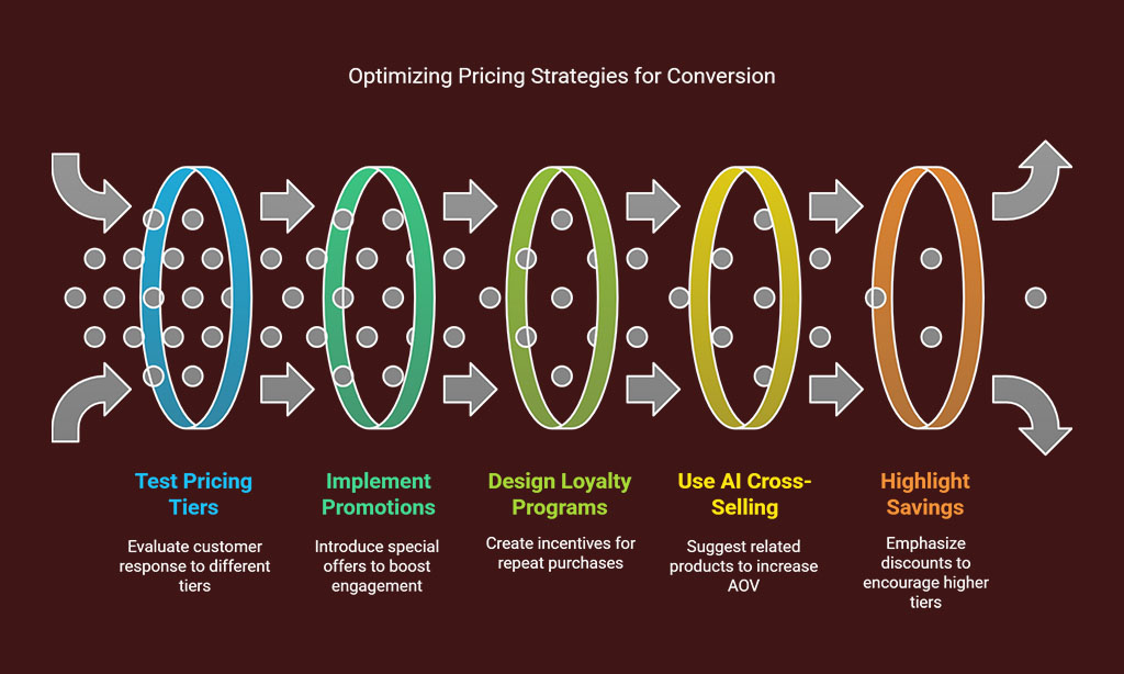
Hey, want to boost your conversion rates with a slick pricing page? Test out varied pricing tiers and special offers to see what grabs your crowd. Curious for more tips? Keep reading!
Test different pricing tiers and offers
Let’s talk about increasing your conversion rates with effective pricing strategies. Testing different pricing tiers and offers can truly transform your business, so let’s get started!
- Begin by trying out various pricing tiers to discover what resonates with your audience for improved conversion rate optimization (CRO). You could provide a basic plan, a mid-tier option, and a premium package. Observe how customers respond to each level. For example, some might be drawn to a budget-friendly starting point, while others recognize the benefits of a higher tier with added features. This split testing can reveal the ideal balance for maximizing your conversion rates.
- Incorporate special promotions to generate excitement and boost lead generation. Consider adding a time-sensitive discount or a package deal. This instills a sense of immediacy, creating a “act now” feeling that encourages quick decisions. Monitor the click-through rates on these promotions to determine if they enhance user interaction on your product pages or checkout page.
- Take cues from major brands like Alaska Airlines, who achieved an 18% increase in loyalty plan sign-ups with tiered pricing. Adopt a similar strategy by designing loyalty levels that benefit returning customers. Evaluate how these promotions affect your average order value (AOV). You may discover that a strategically placed reward converts casual visitors into loyal buyers on your landing pages.
- Experiment with combining pricing tiers with AI-driven cross-sell suggestions, as they can further elevate your AOV. Recommend related products or services at varying price points. Assess whether displaying these suggestions on category pages increases sales. It’s like offering, “If you enjoyed this, why not try that?” and seeing the figures rise.
- Test highlighting savings or discounts linked to specific tiers for a more compelling call to action (CTA). Clearly show customers the amount they save by choosing a higher plan. Evaluate this on your pricing page to see if it encourages more clicks. It’s like presenting an irresistible offer, making the value hard to ignore, especially when paired with visible social proof like customer feedback nearby.
- Pay attention to meaningful data when testing these pricing approaches. Conduct your A/B testing over a sufficient period to gather reliable insights. Minor adjustments in user experience (UX) on your web app or progressive web app (PWA) can have a significant impact. This ensures you’re not just speculating; you’re making decisions based on concrete outcomes to enhance those conversion rates.
- Finally, adjust how you showcase offers based on browsing patterns or dynamic pricing. Test whether personalized promotions on your dashboard or during checkout improve open rates for push notifications. It’s like offering a gentle, customized reminder made just for them. See how this influences total sales and encourages repeat visits.
Experiment with displaying savings or discounts
Hey there, let’s chat about boosting your conversion rates with a smart trick. Showing off savings or discounts can really grab attention and push folks to buy!
- First off, test how you present discounts on your product pages. Try slapping a bold “20% Off” tag right next to the price. Make it pop with bright colors, so it’s hard to miss. This can spark that fear of missing out and nudge customers to act fast.
- Next up, play with showing the total savings at the checkout page. Display a clear line like “You Saved $15 Today!” right before they pay. This little pat on the back can lift their mood and seal the deal for higher conversion rates.
- Also, draw inspiration from Zalora, who saw a 12.3% jump in checkout rates by optimizing return policy visibility. Pair that idea with savings alerts, like a banner saying “Save $10 + Easy Returns!” Tie discounts to trust signals for a double win in conversion rate optimization (CRO).
- Then, experiment with social proof alongside discounts on landing pages. Add a tiny note under the price, something like “500+ Buyers Saved Big!” This mix of savings and customer reviews can skyrocket trust and click-through rates.
- Finally, tweak the wording of your discount offers on category pages. Test phrases like “Grab Your Deal Now!” versus “Limited Time Savings!” See which one drives more user engagement, and watch those conversion rates climb with every A/B testing tweak.
Hey, want to make your website a breeze to explore? Test out simpler navigation bars and play with breadcrumb trails to guide users like a trusty map. Curious how this boosts conversions? Stick around for more tips!
Let’s discuss improving your website’s usability, everyone. Testing streamlined navigation menus can elevate your user experience (UX) and increase conversion rates!
- To start, simplify the navigation bar to include only the essential options users need. Imagine tidying up a cluttered desk; less chaos means less frustration for visitors trying to locate category pages or product pages. A neat menu directs them right to their destination, boosting click-through rates.
- Next, prioritize clear labels for each menu item to eliminate confusion. Think of being at a diner with an unclear menu—you’d probably leave, right? The same applies to websites; unclear terms annoy users and hurt engagement, so test concise, straightforward wording that connects immediately.
- Additionally, consider cutting back on dropdowns or hidden options in your navigation structure. Too many levels create a confusing path, and no one has patience for that on a checkout page. Streamlining offers quicker routes to purchase, significantly enhancing your conversion rate optimization (CRO) efforts.
- Be sure to check how your menu performs across various browsers and devices, friends. A navigation bar that works flawlessly on desktop but fails on mobile is a major setback for lead generation. Ensure every user, regardless of their device, enjoys a seamless experience for improved usability.
- Finally, take a cue from industry leaders like HP, who earned $21M through 500 experimentation campaigns by refining search functionality. Combine your simplified menus with clever adjustments like search query highlighting to increase relevance and click-through rates. This pairing can transform casual visitors into customers, improving your split testing outcomes.
Hey there, readers, let’s talk about making your website easier to use. Breadcrumb trails can be a game-changer for user experience (UX), leading folks through your pages like a reliable guide.
- Breadcrumb trails work like a trail of markers, showing users their location on your site. Consider them a useful feature on product pages or category pages. They assist with finding the way, reducing confusion, and increasing click-through rates. When users know their position, they’re more likely to continue exploring.
- Experiment with different styles of breadcrumb trails to find what resonates with your audience. Maybe try a straightforward “Home > Shop > Product” layout. Or, experiment with colors and fonts to make them stand out as visual elements. This can boost user engagement by making the navigation bar feel effortless.
- Check out how SeaWorld cut bottom-of-funnel failure rates by 50% with ticket purchase optimization. Breadcrumbs could achieve the same for your checkout page. They lead users step-by-step, minimizing drop-offs. Try this on your site to see if it improves conversion rates.
- Test placing breadcrumbs at the top or bottom of pages for comparison. See where they capture attention most effectively. Some users might notice them faster above the content, while others spot them below. This A/B testing can show what enhances lead generation.
- Consider adding breadcrumbs with clear labels to prevent any confusion. Unclear terms can annoy users, so keep it direct and simple. For instance, use specific names like “Men’s Shoes” instead of just “Products.” This precision can elevate the user experience (UX).
- Experiment with interactive features in your breadcrumb trails during testing. Maybe make each link highlight on hover or add a small arrow. Minor adjustments like these can attract attention and encourage clicks. They’re small updates, but they can significantly influence conversion rate optimization (CRO).
Takeaways
Well, folks, we’ve walked through seven solid A/B testing tricks to boost your conversion rates. Think of this as your roadmap to better clicks and sales. Got a website or app? Start testing those call-to-action buttons and headlines now.
Trust me, a tiny tweak can spark a big win!
FAQs
1. What exactly is A/B testing, and how does it boost conversion rates?
Hey, let’s break this down, shall we? A/B testing, often called split testing, is when you try out two versions of something, like landing pages or a call-to-action (CTA), to see which one ramps up conversion rate optimization (CRO). It’s like picking the winning horse in a race, helping you nail better click-through rates!
2. Can tweaking headline variations really improve my conversion rate?
Absolutely, pal! Testing different headline variations on product pages or category pages can grab attention faster than a magician pulling a rabbit outta a hat, driving up user engagement.
Well, think of social proof as your trusty sidekick. Adding customer testimonials or star ratings to a checkout page can build trust quicker than you can say “jackpot,” and testing these elements shows if they lift conversion rates. It’s all about making folks feel safe to click that buy button on your site.
4. Should I test visual elements to hike up my click-through rates?
You bet! Testing visual elements or interactive elements on landing pages can turn a dull visit into a lively user experience (UX), pushing those click-through numbers skyward.
Listen up, tweaking a navigation bar or autocomplete in search results can make browsing a breeze for users. It’s like clearing the clutter from a messy desk, guiding folks straight to what they want on PWAs or category pages. This can seriously boost lead generation and keep ‘em coming back!
6. How do I know if my A/B testing ideas are working for marketing campaigns?
Hey, don’t sweat it, just keep an eye on statistical significance. Whether you’re testing calls to action, content depth, or even stuff tied to trending topics and influencers, track open rates and user engagement to see what’s clicking. It’s like being a detective, piecing together clues to solve the mystery of higher conversion rates!